How might we improve the functioning of a cultural NGO?
stakeholder interview · observation · heuristic evaluation · proto-personas · user flows · branding · prototyping · participant screening · usability testing · front-end development
ABOUT
The Bez Wizy Foundation is a non-governmental cultural organisation based in Warsaw. It was founded in 2001 and brings together actors, historians, visual artists, dancers, musicians and educators. They collaborate on various cultural projects aimed at popularising knowledge in the fields of culture and science.

CHALLENGE
Recently, the foundation identified the need to improve its communication with its recipients. Therefore they commissioned me to create a new, consistent branding as well as to design and program an effective website.
RESEARCH
Kick-off meeting and Stakeholder Interview
I started the project with a kick-off meeting to get to know the organisation’s founders, and conducted a stakeholder interview with them. I learned a lot about the foundation and its users and we discussed which form our cooperation could take. One of outcomes was a tree diagram mapping the core information about the foundation.

Research goals
After the meeting I set the main goals for my research:- study the needs of users and stakeholders
- identify the usability problems of the website
- find and work out strategies for improvement
Observation
“Excuse me, what was the foundation’s name?”
In order to get to know the users better, I decided to conduct an observational study during one of the events organised by the foundation. I wanted to experience their service on my own and get a chance to observe and talk to the foundation’s recipients. I attended a student performance event (debating) in one of Warsaw’s primary schools.
![]()
![]()
One of my findings was a need to make the foundation more visible at its events, which was expressed by pupils and teachers wanting to know more about the foundation after the performances.
Proto-Personas
“Our customers are people, who eager to know more and are ready for challenges.“
I created three personas based on the assumptions formulated during a stakeholder meeting. I wanted to empathize with the foundation’s customers to prepare for a branding phase and create a basis for user flows in prototyping.
Proto-Personas 1 - 3
![]()
![]()
![]()
Heuristic Evaluation


Finding the usability problems
in a user interface design
Along with getting to know the users, my focus was on the website of the organisation. To find the website’s main issues, I carried out a heuristic evaluation, using Nielsen and Molich’s Heuristics List. During the evaluation process, I gathered an overwhelming amount of negative findings - the website was hardly usable. Due to this, I decided to proceed directly to the branding and prototyping phase. I created a prototype of a new website, which could then be subjected to user tests.
BRANDING
Brand Story
From the stakeholder interview I learned that the name FUNDACJA BEZ WIZY (Foundation Without a Visa) originally referred to international cultural exchange programs and nowadays stands for overcoming social, financial and geographical barriers in the popularisation of culture and science.
The schema below combines my findings on the mission and vision of the foundation with the pertinent parts of its name. In creating the branding,
I then aimed to bring this depiction to life.
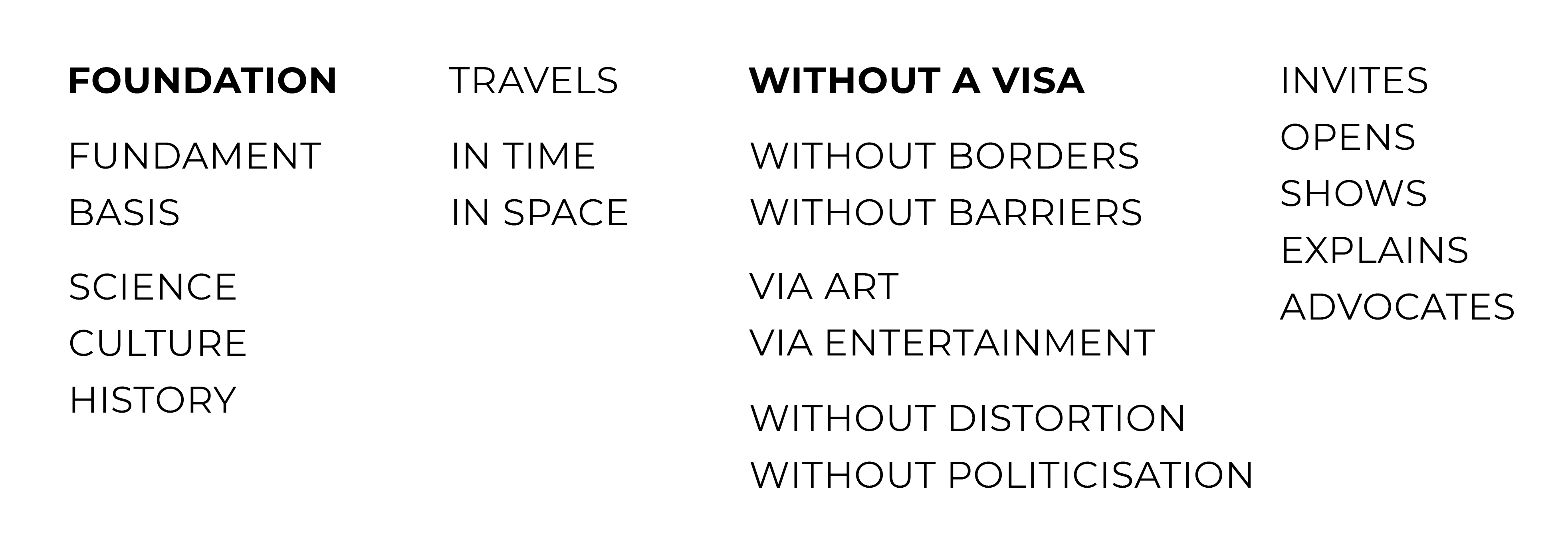
The foundation TRAVELS IN TIME and TRAVELS IN SPACE and enables others to do so as well. The logotype is formed by giving the following syllables of the foundation’s name different typefaces, selected in chronological order according to the historical era that inspired the typeface’s design.
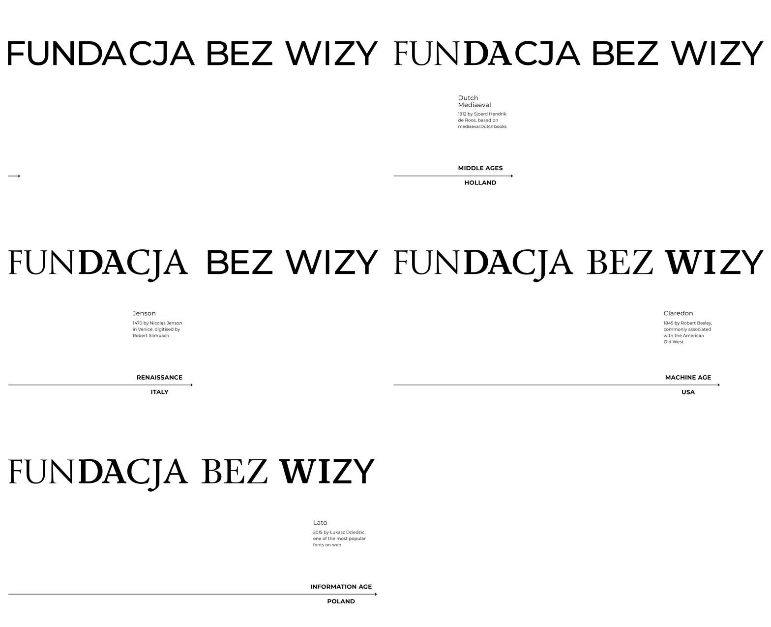
FOUNDATION - FUNDAMENT, BASIS: SCIENCE, CULTURE, HISTORY
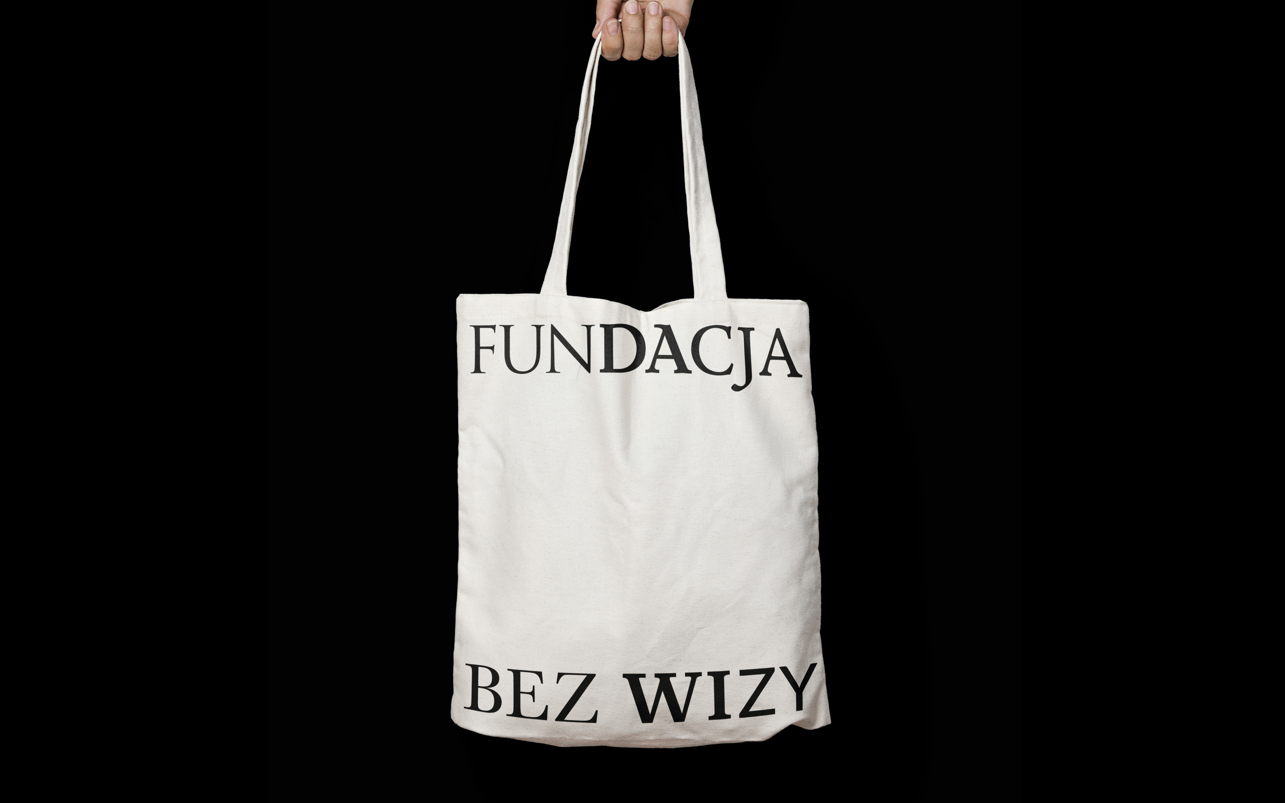
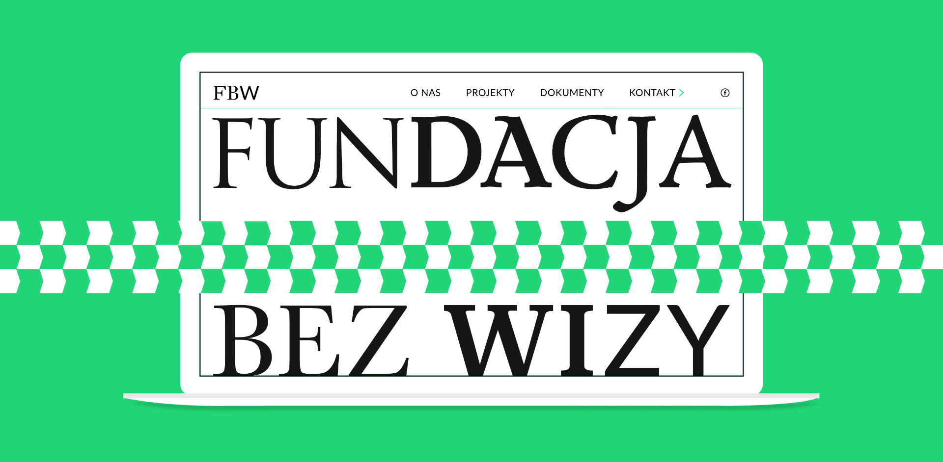
The logotype acts as a frame for other content.
![]()
WITHOUT DISTORTION, WITHOUT POLITICISATION
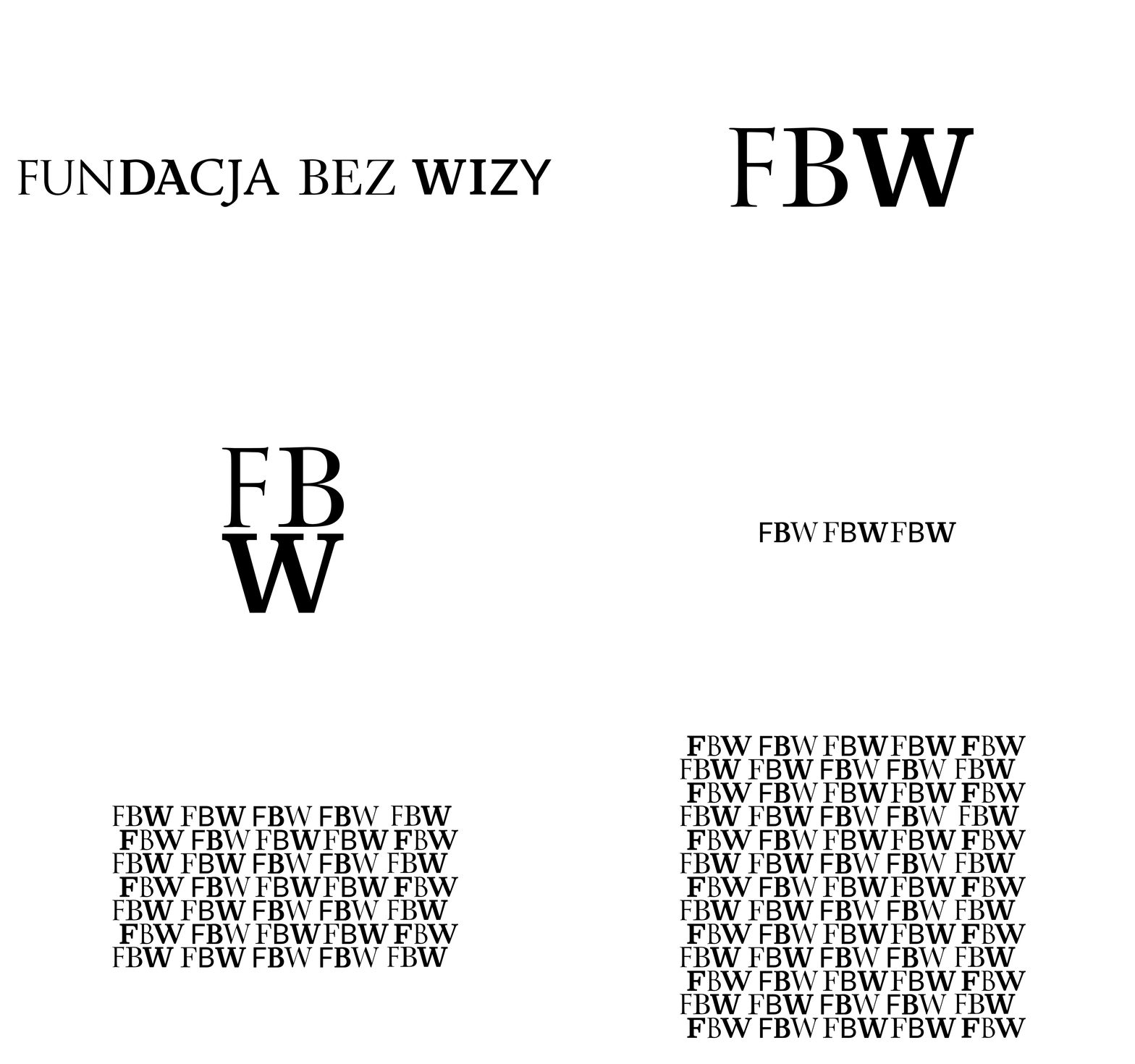
Images and texts remain in the foreground and cover the logotype.
WITHOUT BORDERS, WITHOUT BARRIERS
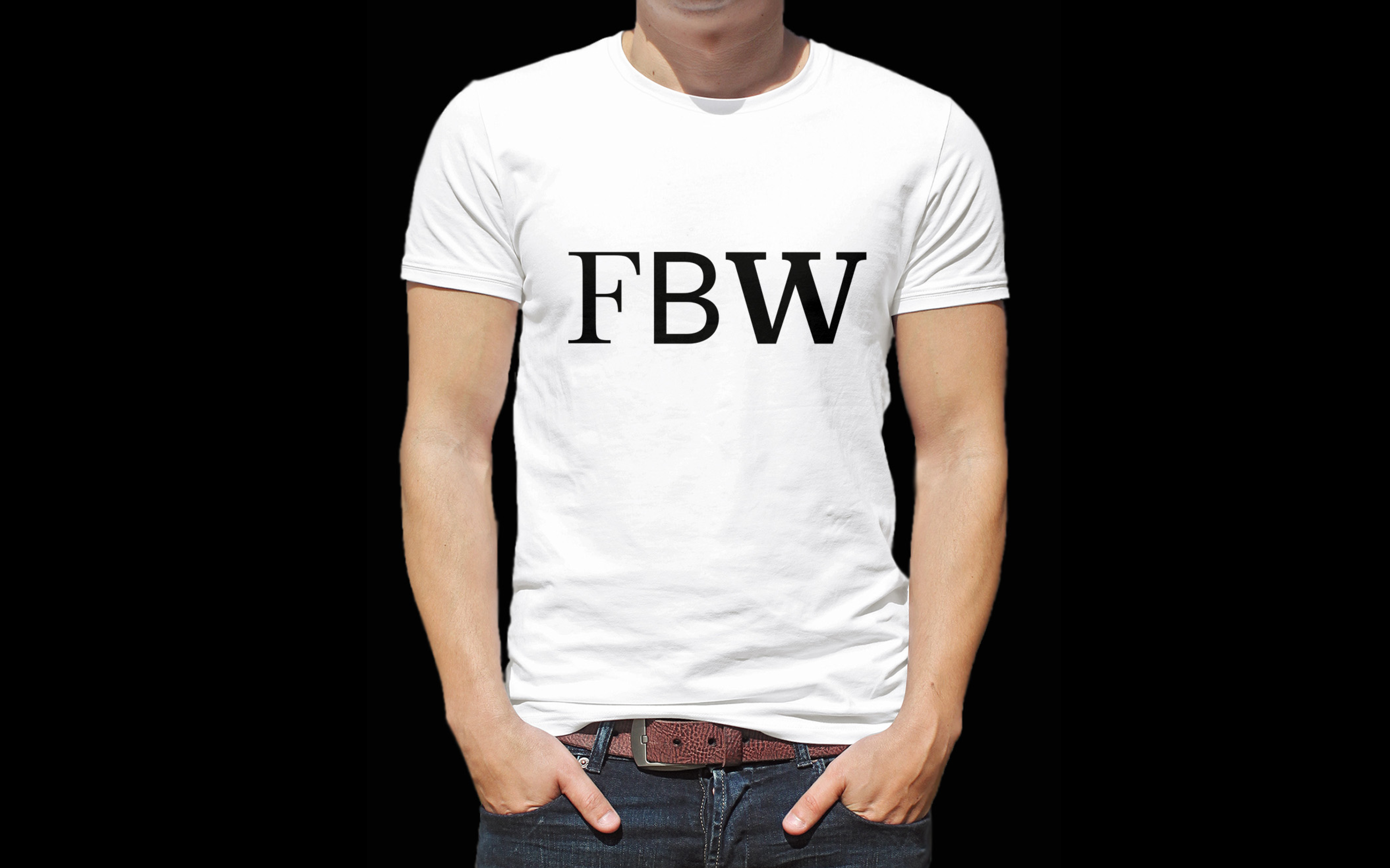
The logotype appears in multiple abbreviated forms.
![]() VIA ENTERTAINMENT, VIA ART
VIA ENTERTAINMENT, VIA ART
The signs form decorative, playful constellations.
![]()
![]()



Special Supplement
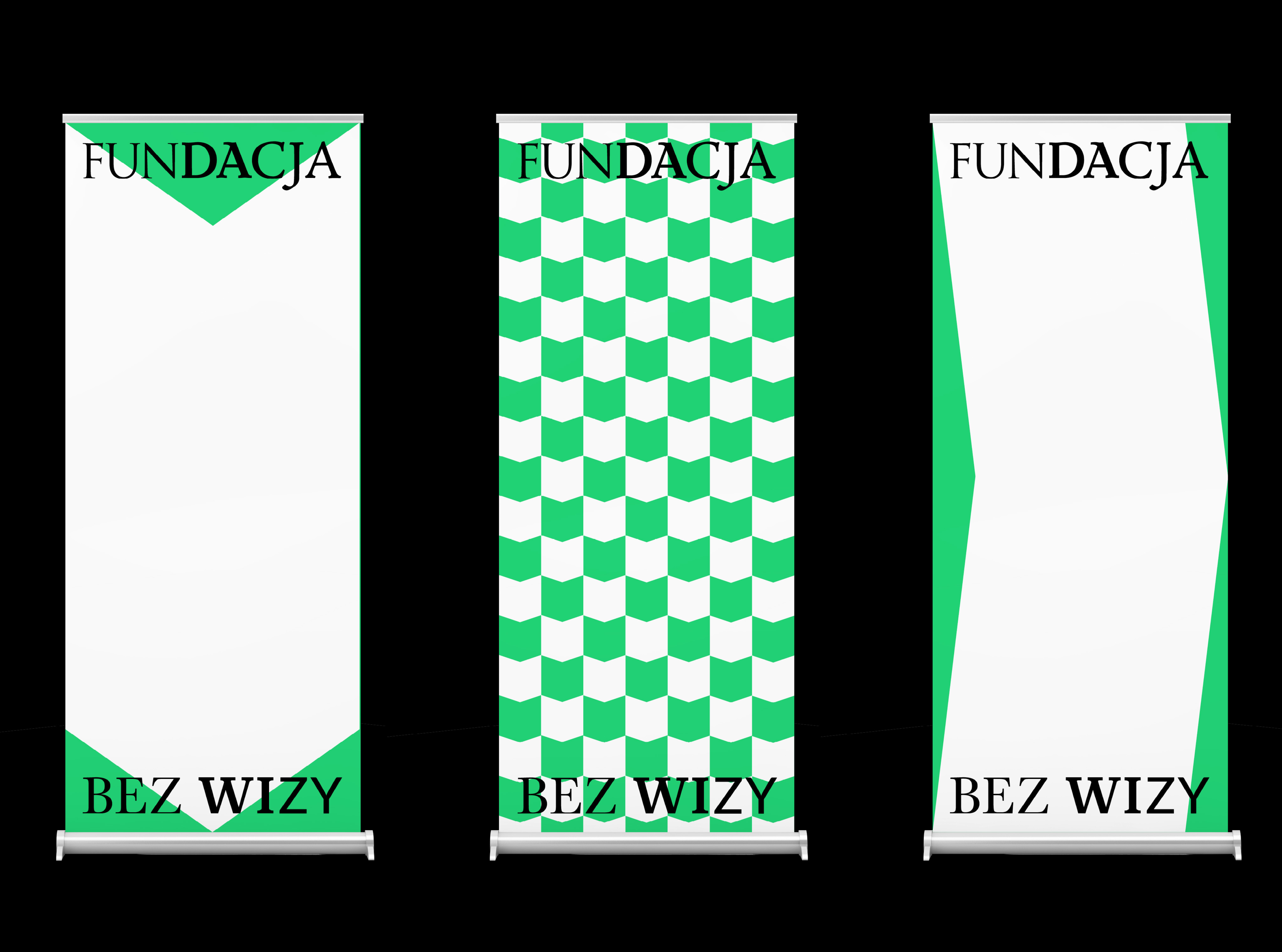
To increase the visibility of the foundation's visual language I added a highlighting color to a minimalist black and white palette and developed an additional sign - an arrow whose different positions stand for the individual pillars of the foundation’s identity.


PROTOTYPING
User Flows
Mapping the dialogue between a person and a product
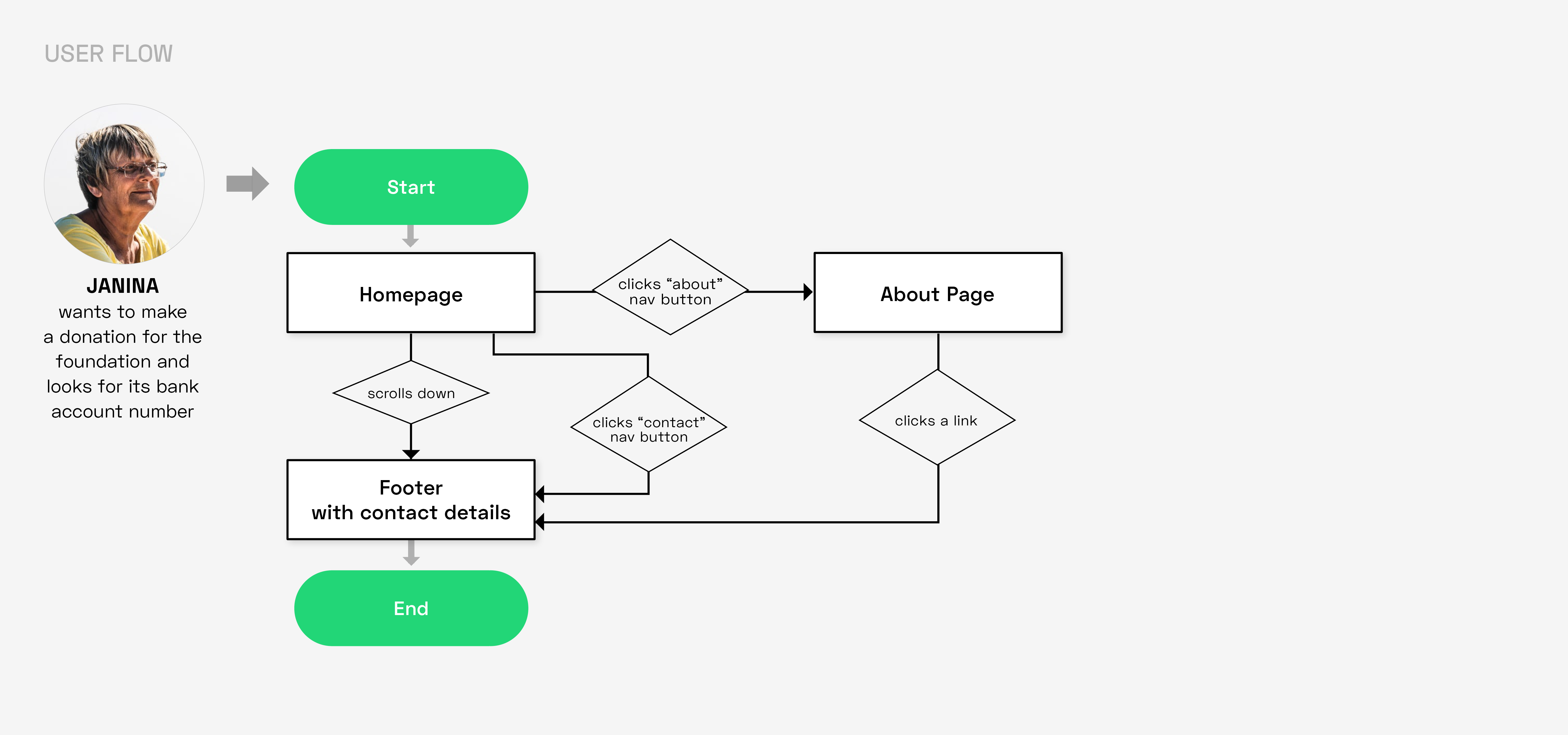
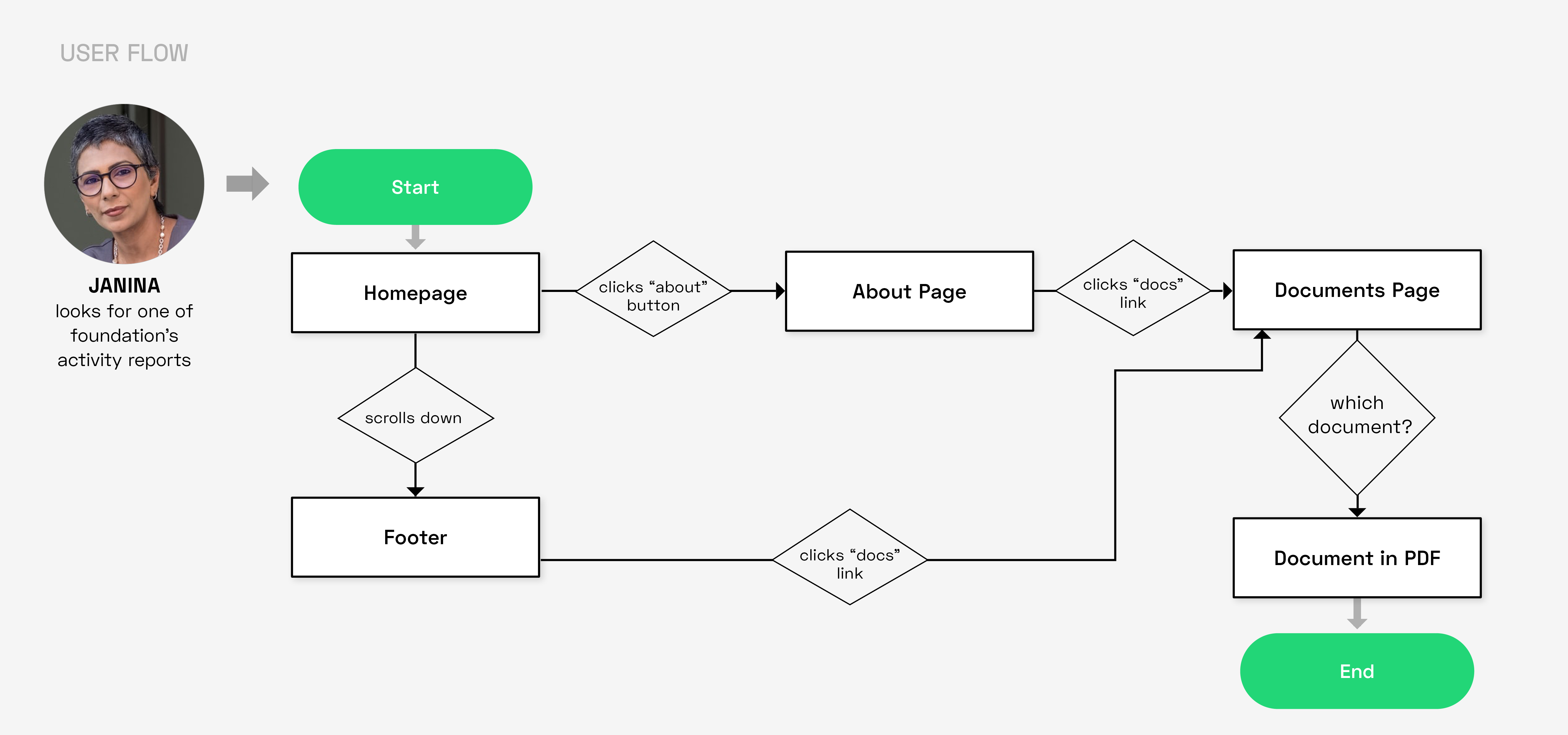
I began the prototyping phase by compiling user flows for the personas. I focused on what the users need to get done on the website, i.e. on delivering it in the most effective manner.
User Flows 1 - 3

The Information Architecture
Because of the complexity of the website, arranging a proper information architecture proved to be a crucial issue. We investigated it via several card sorting tasks and sitemap sketches.
Card Sorting
The cards included topics and elements of the website. Participants were to organize them into groups, which helped to create information architecture that suits the user’s expectations.
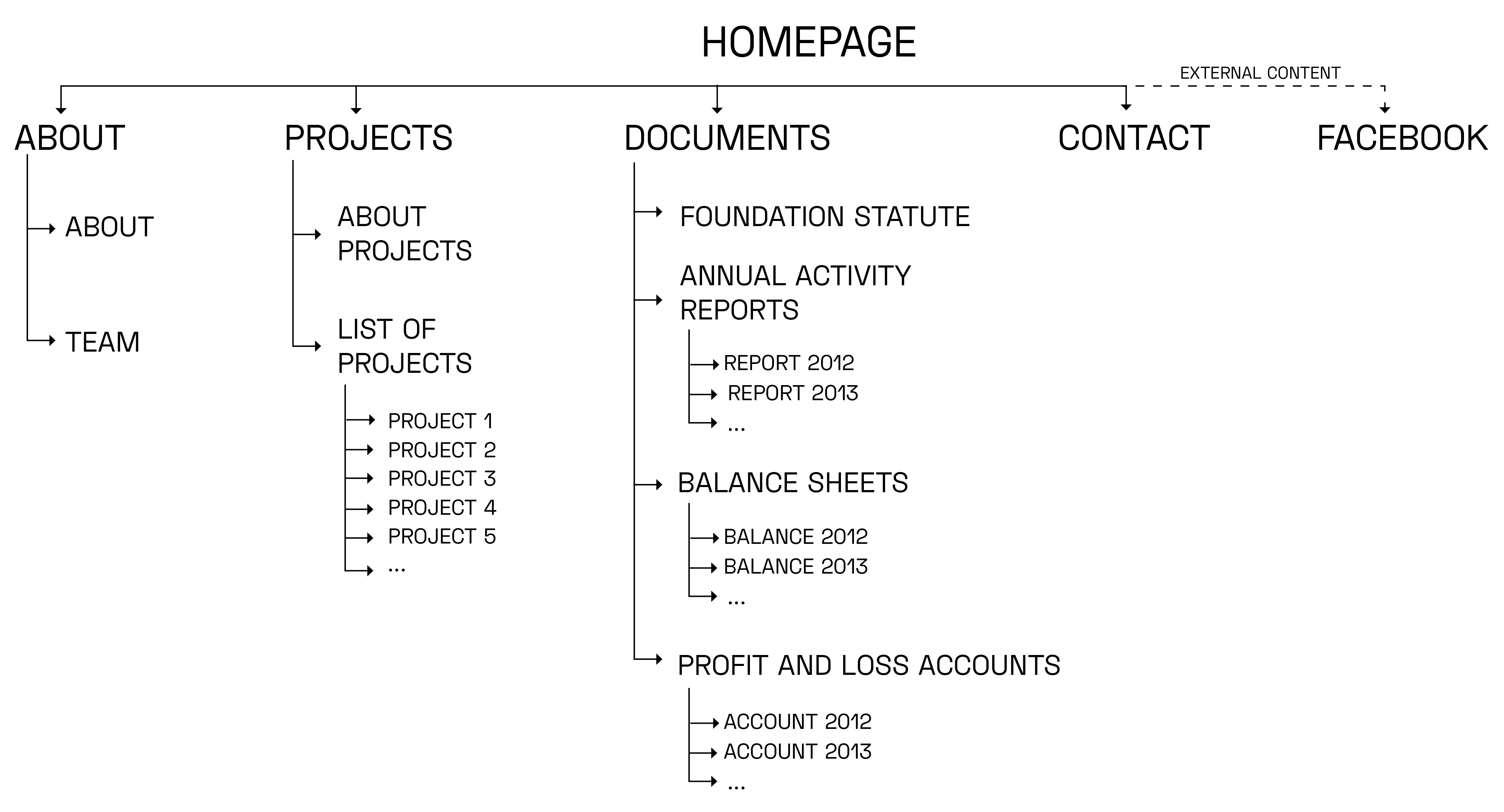
Sitemap
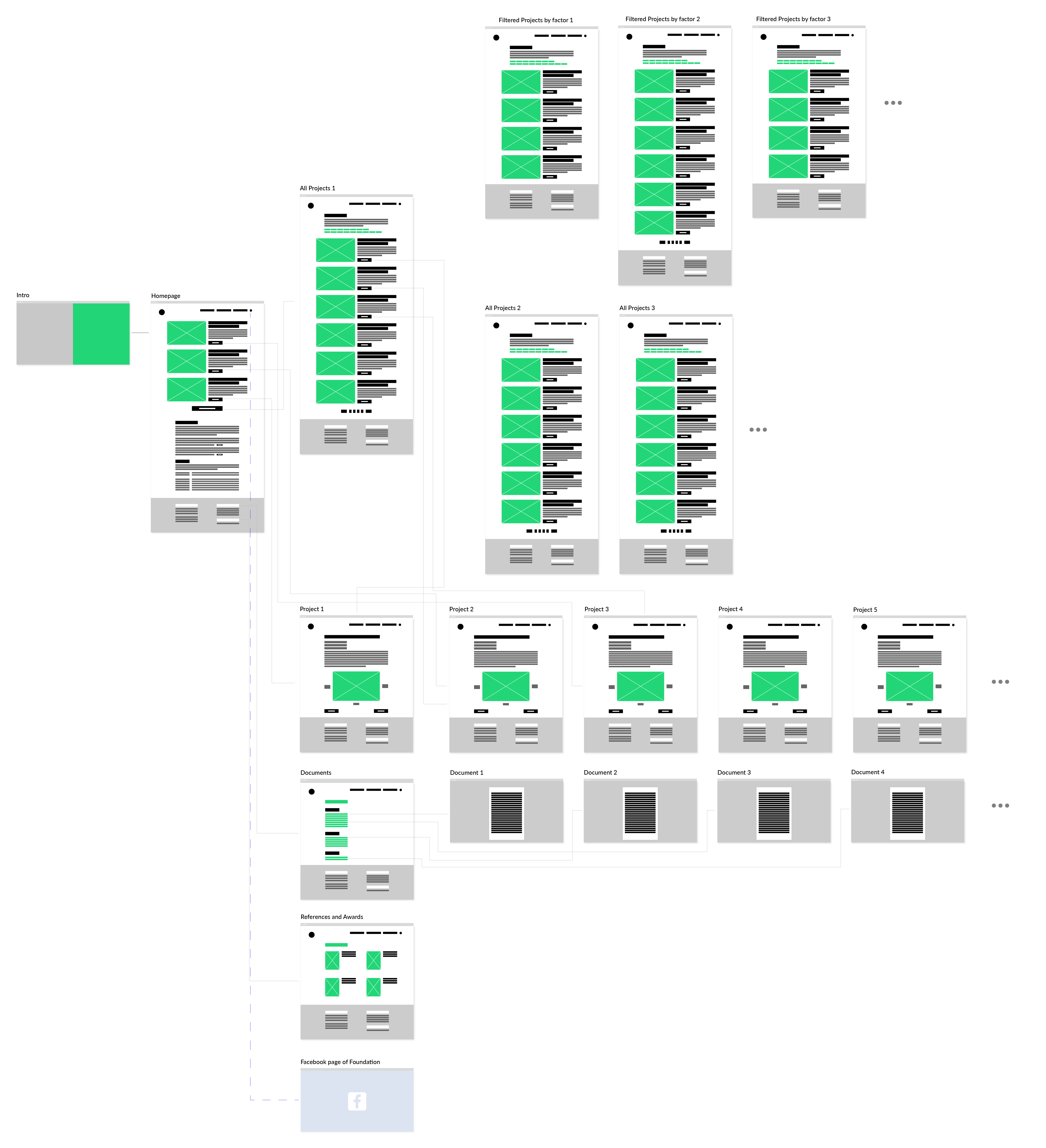
Low-Fidelity Wireframes
As a next step, knowing already how the information should best be structured, I examined various layout options by designing low-fidelity wireframes for the website.
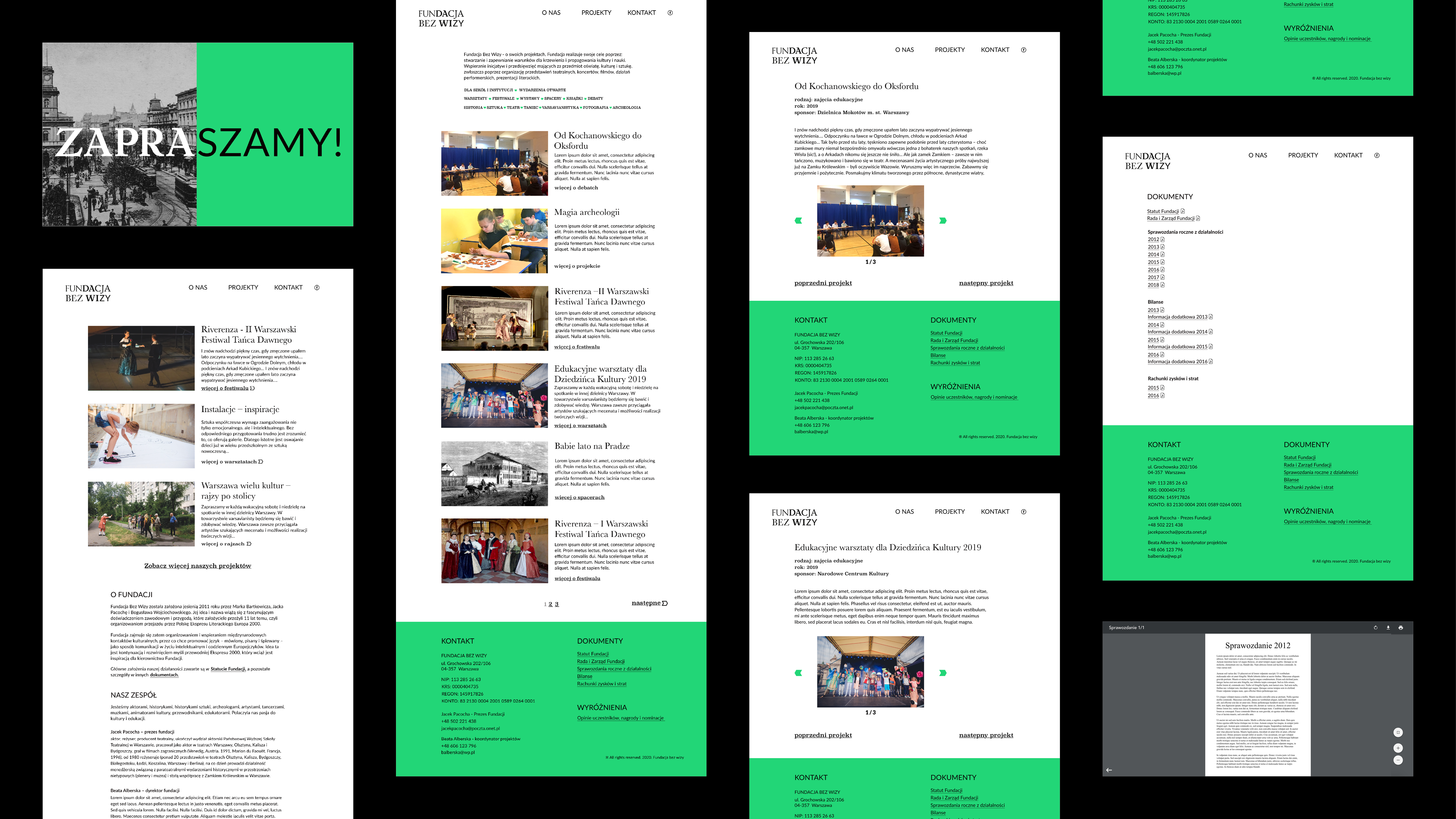
High-Fidelity Wireframes
![]()
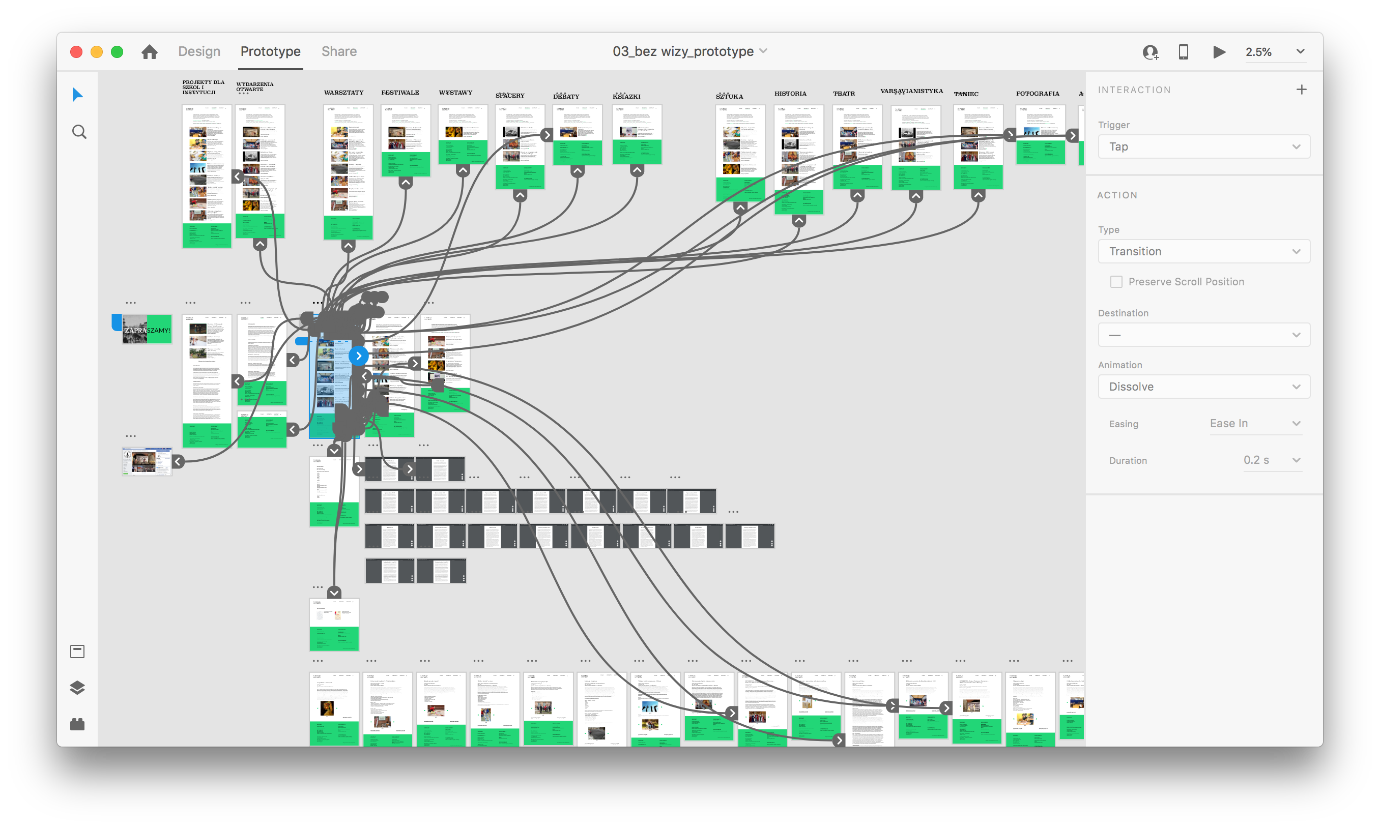
Interactive Prototype
From the high-fidelity wireframes I created an interactive, clickable prototype that was subjected to usability testing.
USIBILITY
TESTING
TESTING
“I really appreciate high legibility of the website.”
I conducted a usability study with 5 participants, selected via participant screening. Each session lasted 30 minutes and included performing 5 tasks with a website prototype. The tasks resulted from previously prepared user flows and were designed to test searchability, findability of several contents and the website’s general impression.
Task Cards

Usability Testing: Findings
Clarity and legibility: In tests with elderly people, this turned out to be a very important issue. I decided to further improve on it, by changing the website's grid and the text size.
Information architecture: When designing the website, I aimed to achieve the most intuitive placement of individual contents. The tests showed that my efforts were successful - the users quickly and efficiently reached their goals and were satisfied. Only minor changes were needed, such as additional links from the About section to various documents or to the foundation's bank account number.
Searchability and findability of the projects: User tests indicated a need for change with respect to project search. I decided to convert a filter based on one-choice radio buttons into multiple-choice checkboxes, which allows for a more precise search of desired content.
FINAL DESIGN
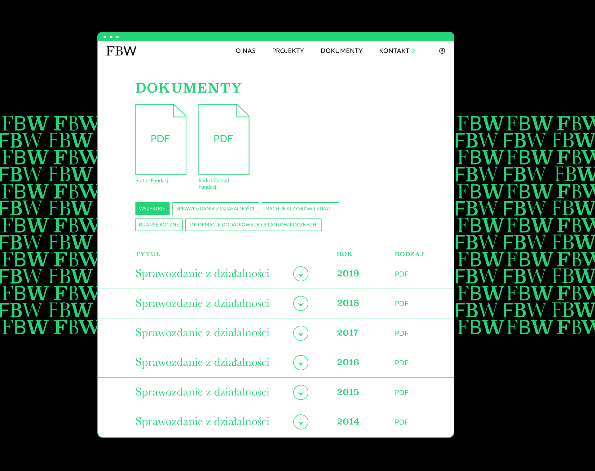
All improvements resulting from the usability testing I have implemented in a final design.
1. Homepage
![]()

2. Projects Site
![]()

3. Single Project Site
![]()

3. Documents Site
![]()
FURTHER
STEPS
STEPS
Currently, I am developing the website’s front-end and combining it with a content management system.
DESIGN
SYSTEM
SYSTEM
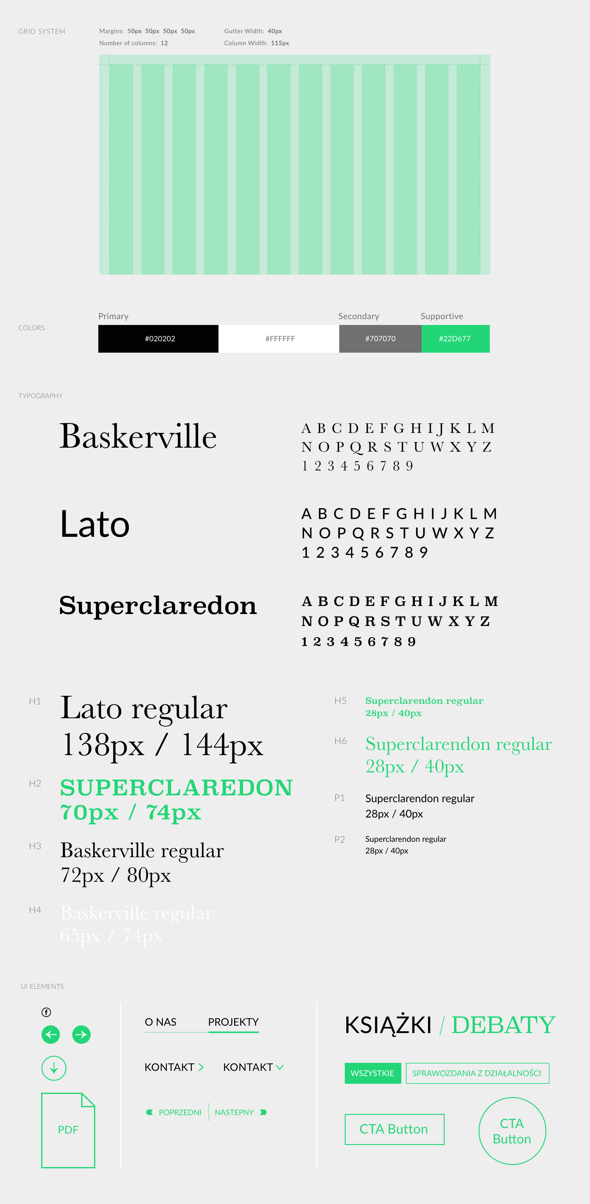
Given that the content of the foundation's website needs to be updated regularly, I developed a User Interface Style Guide that should help in maintaining a consistent style on the site.
