How might we create visual language for a cultural festival?
design concept · branding · branding application design
CHALLENGE
I was asked by the National Culture Center in Poland to create a visual identity for a festival. It's called “The Courtyard of Culture” and takes place every year in summer in the courtyard of the Ministry of Culture and National Heritage in the old town of Warsaw. The festival lasts two months and consists of a series of open-air concerts, shows and workshops.

UNDERSTAND
Audience: Family events intend to interest every generation, including children, teenagers, adults and seniors.
Location: All happenings occur at the capital's Royal Route in the space framed by the eighteenth-century Renaissance palace, which currently houses the Ministry of Culture and National Heritage and nineteenth-century guard-house - an art gallery at present.
Mission: Organisers set the goals of the festival at expanding cultural horizons by promoting knowledge in the field of history, music and art.
Concept: The festival takes place in 8 weekends over two months. Every event is built around a specific topic and consists of a workshop or show and a concert. This year, events were developed around eight titles being etymological references to the word courtyard, for example: manor, market, yard, arena, forum.
NEEDS
Visual language attractive to a wide range of recipients, from children to seniors
System giving a face to every event and at the same time keeping general cohesion
Aesthetics arousing attention and fitting well with the historical surroundings
GOALS
Creating a coherent, consistent visual language of the festival, attractive to a wide audience and able to communicate complex content.
DESIGN
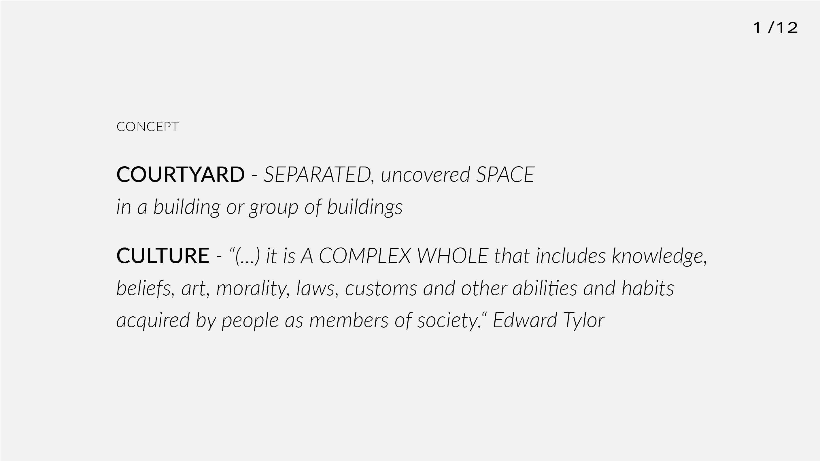
After several ideation sessions with brainstorming, visual research and sketching I decided to base the concept of design on definitions of courtyard and culture.
![]()
This way, I narrowed my search to visual means able to capture "separated space" and "complex whole" within it.
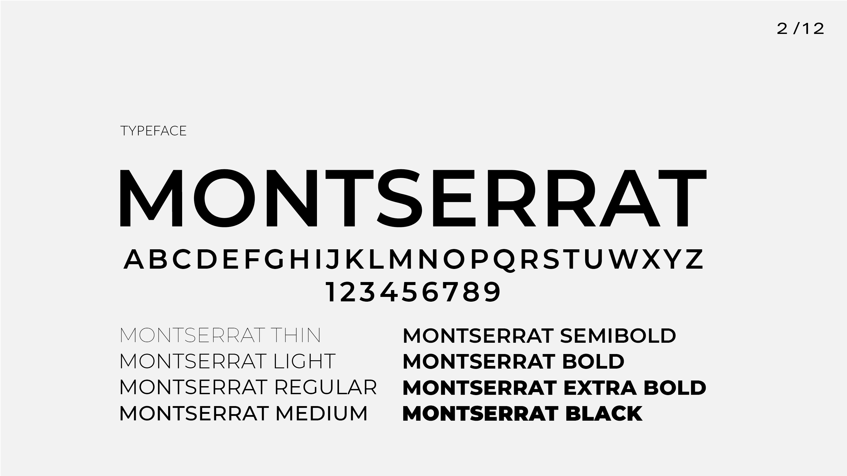
Continuing, I selected a Montserrat sans-serif typeface designed by Argentinian designer Julieta Ulanovsky. My choice fell on this typeface, because of its strongly geometric construction and the fact that it was designed on the basis of the old posters and signs from one of the neighbourhoods of Buenos Aires. Their strong urban character suited well to the intended applications of my designs.

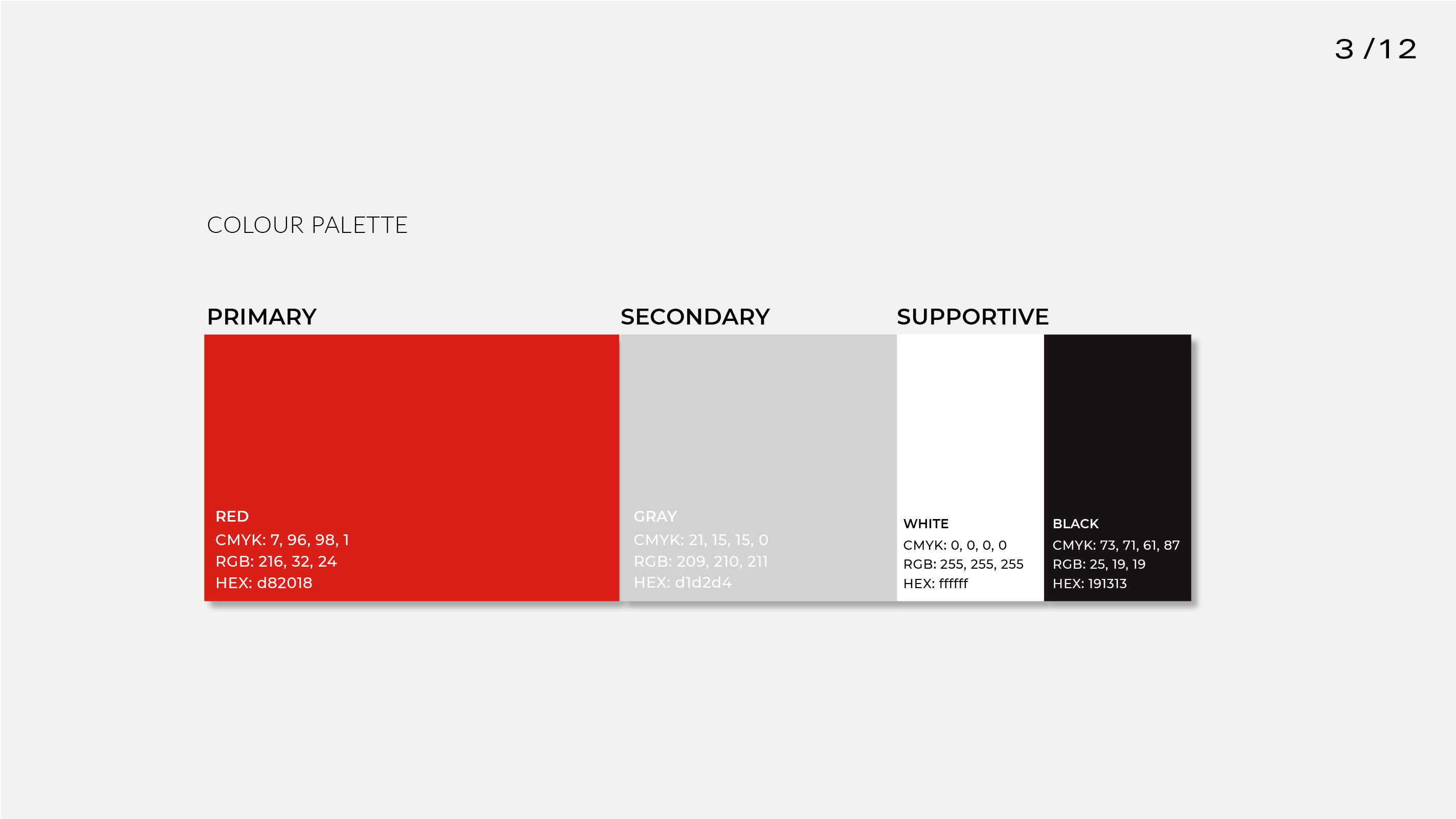
The colour palette consisting of red, gray, black and white, I adopted from the visual identity of the National Cultural Center, which was one of the constraints of the project.

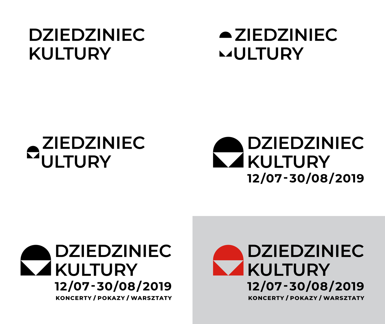
In the next step, I developed a sign out of the first letters of the festival’s name. D and K rotated vertically, built of geometric figures referring to the shape of gate, court or renaissance window, what strongly relates to the location and topic of the venture.

The sign elements - a semicircle and two triangles, in the original logo close each other creating a "separated space". In the next step, I use these components to build a series of pictograms for each event, this way it arises - a "complex whole".
![]()
RESULTS
The created visual language I used it to design festival posters, leaflets, online announcements, stage banners and giveaways.


